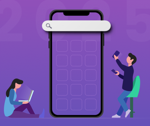
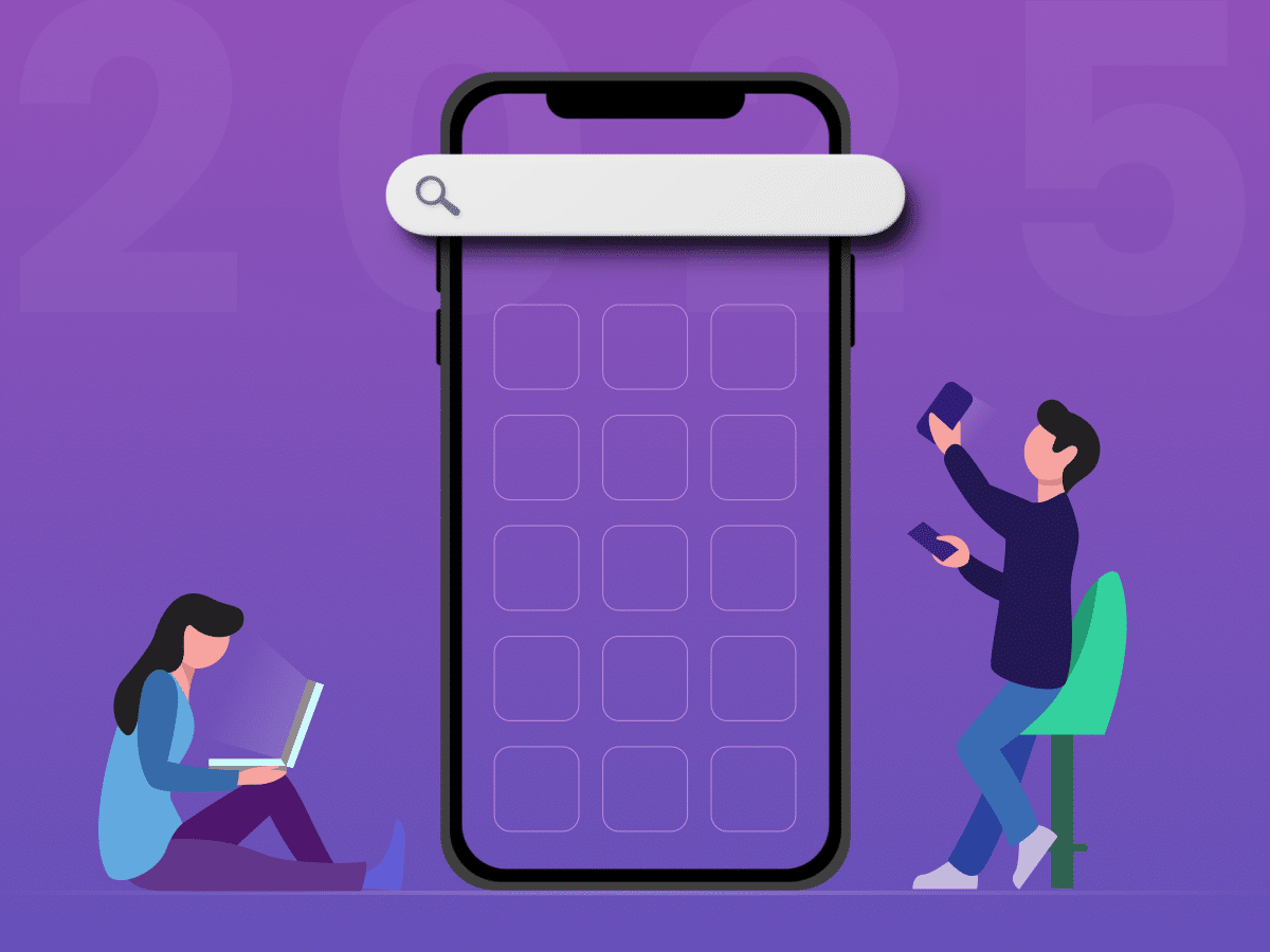
Do’s & Don’ts You Must Keep in Mind for Responsive Website Design

-
 Ankit Patel
 - March 31, 2018
- 3 min read

“The traffic from mobile devices was almost 52.64% of the global online traffic during the year 2017…”
“It is predicted that 79% of the global internet usage will be driven via mobile devices by the end of 2018”
“Even Google has introduced recommendation 3 years back in favor of responsive website design, and started considering websites optimized for mobile devices!”
From the above stats, the question is not whether we should go for responsive web design or not. In fact, it clearly shows that we are using it exponentially when it comes to designing a website these days. The responsive design is not a single technology but a bunch of different techniques enabling a simple website to cater different screen resolutions of different devices.
However, the responsive website design is not all about cramming everything to fit into a smaller screen of the mobile devices. But, it is more of adding a flexibility quotient to your existing website. Starting from the layouts, image size, and texts to the contents, everything must be having flexibility in it.
Okay, enough of the story! Let’s take a look at the do’s and don’ts of responsive website design you must follow for your designing project.
• DON’T do it because all are doing it and it’s in demand!!!
Of course, designing a responsive website is in swag. But does it mean that you also have to chase it to get the limelight? It’s a wrong perception! Think about whether your target audience is going to browse your website through a mobile device? And try to know how and why they browse your website through any of the hand-held devices.
Don’t just follow the trend blindly and think practically whether you really need a responsive website. Think how your audience is going to use your website from mobile devices.
• DO understand the significance of LARGE fonts
Forget about how you’re viewing your website on the conventional desktop because there you’re viewing fonts in a huge 22-inch screen. But, what about the smartphone users? They’ve very small screen to view the contents and forcing them to read those tiny fonts could really piss-off their mind. Try to stretch the font size to its max. Go for 16 pixels font size as a thumb rule while designing a site for the multiple devices.
• DON’T underestimate touch screens of handheld devices!
All the smartphones and tablet devices are having a touch screen, and even mobile users expecting to have seamless support for fingers and thumbs. No matter how professional a responsive web design company is, but they ignore touchscreen support while designing a website, it will frustrate the users for sure!
Try to make the links easily pushable and larger. Also, try to consider imprecise touch from the users and make it as realistic as possible. Don’t forget considering the size of the human finger to achieve finger-friendly mobile website design.
• DO pay attention to the content of your site
Content is a KING, but what if it is not optimized considering the mobile devices? Well, with continuous amendments from Google in its search engine algorithms and recommendation for the mobile-friendly content, it is important to take the content optimization very seriously. It will help your site rank higher during the search by the mobile users if used proper keywords and optimized appropriately.
• DON’T go crazy while designing a layout
You might have seen plenty of websites filled with boxes, boxes, and boxes. And all those are of different shapes and sizes. Well, seems uneasy and unpleasant, right? Being a professional responsive web design company, you must know the significance of placing things rightly. You cannot juggle with the user experience when you’re designing for the global audience for your website.
• DO keep user experience at the top of your priority list!
Of course, you can design almost everything, and you can fill your website with all the things available to add glamour in the website. But does that mean you mix everything and everywhere when you design a website for mobile devices! Just try think from the end user perspective and know what they actually want from you. They’re least concerned about how responsive your website is, but what they are concerned is how your website is beneficial to them.
• DON’T go for bigger file
The motive for the responsive website is to give the information in a most mobile-friendly way. But that doesn’t mean you try to pile-up file size to accommodate everything on the tiny device screen. The larger the file size, the slower your website is. This will push away the target audience for whom you’re designing and putting so much effort. Your responsive website should be as lighter as it can be.
Aside from these basic do’s and don’ts, you should not forget to test your website on all the handheld devices you’re targeting. Just remember, the responsive website design doesn’t mean you pileup everything you know, but it is more about delivering the amazing user experience to the mobile users. Do you have more do’s and don’ts in your mind? Share it in the comment below.
Ankit Patel is a Director of Sales & Marketing at XongoLab Technologies LLP and PeppyOcean, A leading mobile app development companies. In his free time, He likes to write articles about technology, marketing, business, web, and mobile. His articles featured on YourStory, E27, Datafloq, JaxEnter, TechTarget, eLearningAdobe, DesignWebKit, InstantShift, Business Magazine, SimpleProgrammer, and many more.
You may also like
How to Choose the Right Mobile App Development Company
- Ankit Patel
Imagine this: you’ve got a brilliant app idea that could revolutionize your business, take it to new heights, and transform your entire customer experience. But without the right team to… Read More
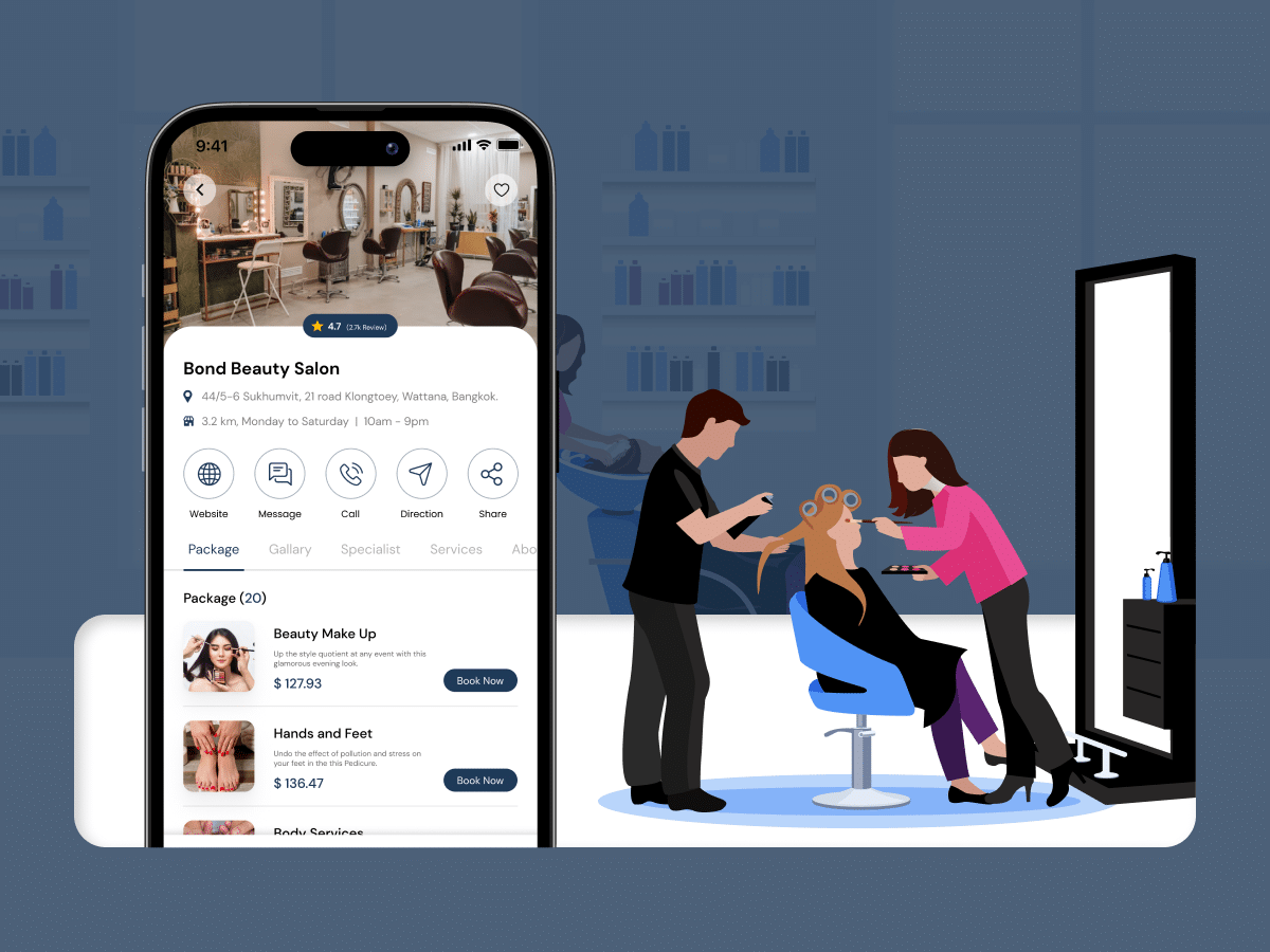
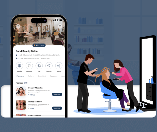
How Much Does it Cost to Build a Salon Booking App like Fresha?
- Ankit Patel
We all have witnessed the buzz in the world of beauty & wellness, and it’s booming every day thanks to the fast-paced and stressful lifestyle. In an era where time… Read More
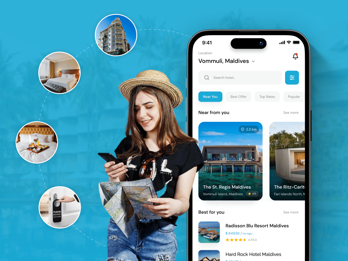
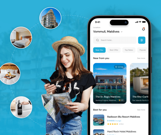
A Complete Guide to Hotel Booking App Development With Cost
- Ankit Patel
Whether it’s a corporate business trip or a relaxing vacation with friends, finding the right hotel at the right time and a seamless hotel booking experience is not a luxury… Read More